top of page
We Are In This Together
- Communal inclusion plan for art and design students in higher education
[Real world potential and impact]
RCA, 2023
An activity tool kit consists of a black fabric bag for curated objects, a deck of activity cards with white tuck box, and a workbook with a white cover. The title of the project ‘WE ARE IN THIS TOGETHER’ is written on the covers of all 3 parts.

As awareness and acceptance of different kinds of disabilities are on the rise in many areas in the world, it’s good to see that the industry is encouraging actually disabled people to design, or at least, to co-design assistive technologies and in spheres related to disability. However, very little has been done to support disabled art and design students to navigate the dual identity of both an artist / designer and a disabled person.

​

WE ARE IN THIS TOGETHER aims to address the issues surrounding navigating higher education in art and design as a disabled person, through creating a handbook, a curated set of discussion objects, and a set of activity cards that would provide some guidance, prompt conversations around related topics, assist self and peer reflection, etc. In short, the project is envisioned to be a communal inclusion plan that welcomes everyone into the conversations surrounding disability and neurodivergent minds.

Diagram and schematics showing the interaction process for the activity cards and workbook

Diagram and schematics showing the interaction process for the activity cards and workbook

​

2 copies of the workbook, both unopened. 'We are in this together' is written on both covers. The covers are white, and the texts are black, apart from the word 'together', which has 4 colours: green, blue, orange, and red
The workbook is opened to the page of ‘disability and terminology’. There are 6 squares of different colours on the page, each with different texts and facts about disability and terminology. Each square can be torn off from the page, and be placed or kept elsewhere.

WE ARE IN THIS TOGETHER Workbook – The workbook is divided into 7 chapters, each covering different topics, ranging from more generic information about disability history, to more controversial issues such as terminologies or sexuality, as well as more nuanced or complex facets around disability, such as disability burnout, and clashing support needs.

​

​For some pages, the content is organised into squares that can be torn off from the pages. The user can tear off the squares that they think appropriate and put them elsewhere, such as on their locker, use it as a bookmark, or give it to another person.

a gif showing different pages within the workbook. A blank page left for notes and thoughts, a page explaining disability and sexuality, a page discussing disability and nuances, and pages showcasing different artists and designers
The workbook is opened to the chapter 3 cover page of ‘disability and design history’. The tuck box for activity cards is open, placed next to the workbook. 2 cards are placed on the book page. One is a discussion card about disability terminology. The other is a fact card about hidden disabilities.

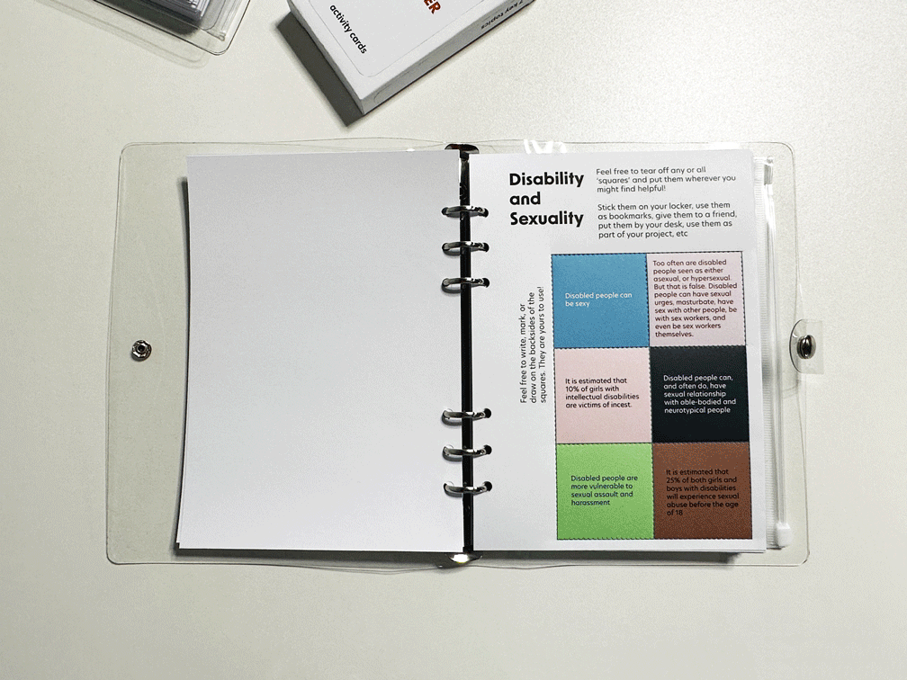
There are blank pages for the users to take notes on. They can use the pages however they want: to write down discussion topics, their self-discovery, something they’ve learnt through chatting with others, or even a doodle. Due to the customisable nature of the workbook, each person’s book would grow as the person grows. Although everyone would start off with the same copy, each copy would grow into its own unique and complex collection of thoughts, discussions, and memories, reflecting the person’s journey.

​

​Apart from being colour-coded by the activity categories, the activity cards also have numbers on the back, correlating to different chapters in the workbook. The cards can be used in conjunction with the workbook. If the users only want to pick out cards relating to one specific chapter, they can select the cards with the same number from the deck. Or if they wish to know more about a certain topic while interacting with shuffled cards, they can also locate the corresponding chapter.

The activity cards, along with the tuck box, is stored in the plastic pouch available in the workbook.

The activity cards, along with the tuck box, can be stored in the plastic pouch available in the workbook.

The front of the tuck box for cards. The box is white, with the texts 'We are in this together' on it, written in bold letters. 'activity cards' is written below the title in smaller texts
Activity Cards Version 2

Graphic design and visual identity created in collaboration with Beatrice Sangster
(RCA MA Visual Communication Alumni 2023)
The cardbox is emptied. Most of the cards are in a deck, and several cards are in the foreground, flipped over, showing the QR codes
The cardbox is emptied. The cards are organised into 2 decks
6 cards all relating to chapter 4 in the workbook. 3 are flipped over showing the number 4 as well as QR codes
the cardbox is opened, and several cards are spilling out from the box, showing the top half of the content. 5 green LEARN cards are placed next to the cardbox. The cards are all flipped over, showing the QR codes
The cardbox is emptied. The cards are scattered next to the box.
A close up of the QR and the braille letter on the cards. The braille letters are QR, which are placed right above each QR code. So that blind and visually impaired people can feel the braille and locate the QR code
Diagram and schematics showing the interaction process for the activity objects bag

Diagram and schematics showing the interaction process for the activity objects bag

​

The object bag is opened to show different curated objects. All the objects are stored in translucent plastic pouches. Each object has a red coloured discussion prompt, either placed understand the object, or next to the object
A blue pop-it fidget tool is placed next to its red coloured discussion prompt text inside the unfolded activity bag.

The curated objects were selected based on either their prevalence in disabled people’s lives, or their interesting / controversial design history. Under or next to each object, written against a red background, is the discussion prompt. The user needs to either take out the object first, or to take out the folded-up red paper to read the prompt.

​

The users can also keep and use certain objects in their everyday life if they wish. A good example would be the pop-it fidget toy, since many people would find it satisfying to play with.

A pin in the shape and colour of rainbow infinity symbol is placed next to its discussion prompt as well as its green coloured learn card.
2 blue puzzle pieces are placed next to their red prompt texts and a green coloured learn card

For many of the curated objects, there are also corresponding LEARN cards, from which the user can learn about the facts and history of that particular object.

​

On the left half of the image are several fact cards with a red RADAR key. One card is flipped over, showing the back. There is a QR code on the back, with braille letters QR embossed next to the QR code. The red RADAR key is placed next to its corresponding fact card that says ‘NKS (National Key Scheme) Radar disabled toilet access key’.   On the right half of the image is a screenshot of the webpage content after the user scans the QR code. It shows a digitised version of the same content as the ‘hidden disabilities’ fact card.
A diagram explaining that the activity cards can be used differently depending on the number of people interacting. If the person is doing the activities by themselves, they can choose from 'learn', 'think', and 'try' categories. If multiple people are doing activities together, then they can choose from 'learn', 'try', and 'discuss'

On the back of each card, braille letters QR are embossed next to the QR code. This would make it easier for blind and visually impaired people to locate and scan the code, which would then lead them to a digitised version of the same content on that particular card. They can then access the content using their screen readers. The image on the right shows what the ‘Hidden Disabilities’ page looks like as the digitalised version. All QR codes and digitalised content are updated and working.

Display for the RCA Degree Show 2023
An overview shot of the communal inclusion plan activity tool kit on a plinth top. The activity bag is half opened and placed in the foreground. Some of the activity cards are placed on the plinth top, while the rest are still in the cardbox. One copy of the workbook is closed, the other opened to show the content
close up of the cover of the activity bag. the title 'we are in this together' in bold letters are written on the cover
close up of the activity cards, as well as the red coloured vinyl letterings on the plinth. the vinyl letters are used to label as well as explain the function of each part of the project
a closer up shot of the plinth top. the closed workbook is placed behind the half opened activity bag. there is a business card holder with lilac coloured square business cards. there is a loose pile of multi-coloured square cards in the background
a close up of the closed workbook and the business cards next to it
a close up shot of a person flipping through the workbook pages. only the person's arm and the workbook are shown
a whiteboard with various kinds of magnets. cards that are available for taking and keeping are presented on the hook shaped magnets. smaller red magnets are being used to pin up multi-coloured squares with various messages written on
bottom of page